Porto Wine Label | Living Campus
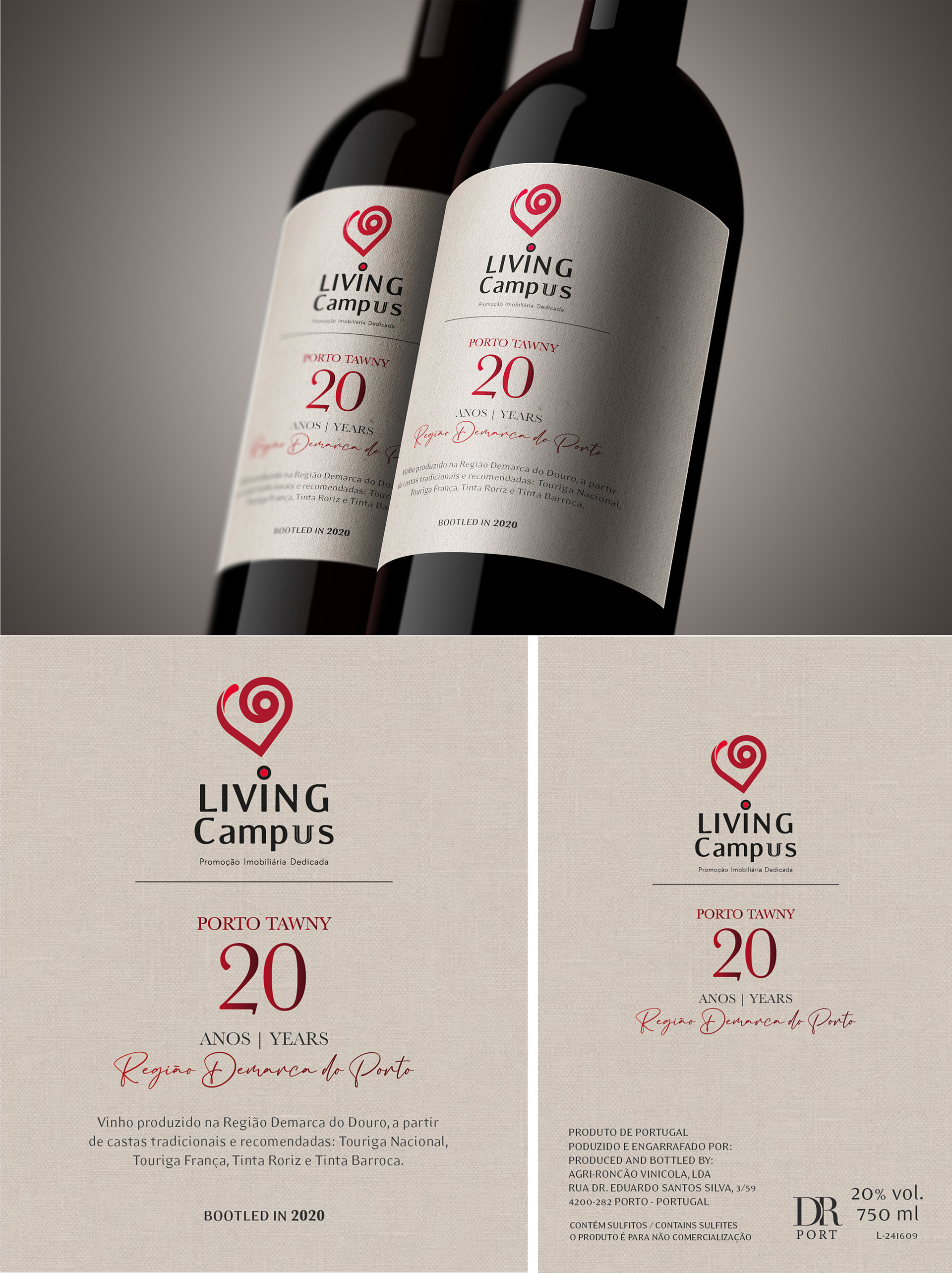
The label designed for the Tawny Port wine incorporates a color palette of dark beige and chrome red, chosen to evoke a sense of richness and sophistication.
These colors are complemented by textures that convey an antique feel, appealing to discerning connoisseurs who appreciate the heritage and craftsmanship of fine wines. The dark beige hue provides a timeless backdrop, while the chrome red accents add a touch of elegance and depth to the label, symbolizing the intensity and complexity of the Tawny Port.
This design aims to capture the essence of tradition and quality, enticing enthusiasts to explore and savor the distinct flavors of this esteemed wine.